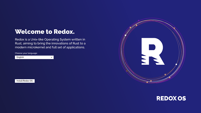
Made this logo for Redox. The triangles aren’t random, they should represent the transfer of electrons in an oxidation process. They should also make the font look like a “feather”, in order to demonstrate the “lightness” of the OS.
Not sure if this is a good contribution. I am a cartography / map designer, haven’t done too much graphic design.
I could make a press kit if interested. Font used is Raleway Heavy.
I do agree for Material Icons. They are made for UI design, and even used in production (in the Google Chrome OS). They are simple, don’t fall out of style and don’t look like 2006. The Apache license allows use in a MIT project, the GNU GPL license (GNOME icons) would be more restrictive for people who want to use the OS embedded. Plus they simply don’t look modern. Functional, yes, but they look like something from the era of 2007 - 2010, when strong gradients and outlines and lens flares were “in”. Just my opinion.
